Wednesday, February 25, 2015

How long would it take to melt all the snow from Boston’s streets and sidewalks?

tractor emptying snow into snow melter

Record snowfall this year – at least 100 inches since late January 2015 as of this writing – has nearly brought the City of Boston to its cold knees. The City has made a valiant (or maybe quixotic) attempt to attack the problem head on by employing diesel-powered snow melters. The Mayor has touted the tonnage of snow melted as a measure of progress. The city has use of four (borrowed) snow melters, with a combined capacity of melting 700 tons of snow per hour. That sounds impressive, but how big of a dent does it make? Let’s figure it out.

According to MassDOT data, there are approximately 1,332 miles of roads and rights of way in Boston. If we take into account the widths of these roads and rights of way (including sidewalks), we calculate a total area of 10.71 square miles or 298,643,564 square feet.

Let’s assume 100 inches of snow has fallen uniformly across Boston, which equates to a depth of about 8.33 feet of snow (taller than Big Bird!).

The volume of all this snow is then Area x Depth = 2,488,696,367 cubic feet of snow on Boston’s streets and sidewalks. Whoa.

 Because it’s been so cold, we can assume that the snow has been fairly light and fluffy (yet no less annoying). Let’s assume a density of 10 pounds per cubic foot of snow.

The combined weight of all that snow is then Density x Volume = 24,886,963,667 pounds of snow. At 2,000 pounds per ton, that comes to 12,443,482 tons of snow on Boston’s streets and sidewalks. Double whoa.

At 700 tons of snow melted per hour, the time it would take the City’s snow melters to clear Boston’s streets and sidewalks is 12,443,482 tons ÷ 700 tons/hour = 17,776 hours!

So, running around the clock – 24 hours per day, 7 days a week, 52 weeks a year - it would take just over 2 years to melt all the snow from Boston’s streets and sidewalks!

At that rate we should be ready for the next big snowstorm by late February 2017 (assuming it doesn’t snow again before then).

Of course, this whole exercise may sound a little unrealistic, since we all know that the City makes no effort to clear snow from sidewalks.

pedestrian standing in front of snow pile

Tuesday, November 11, 2014

Are We All Ferguson?

How unique is the situation in Ferguson, Missouri - racially speaking?

What does the shooting of Michael Brown in Ferguson, Missouri and the ensuing debates and protests say about race relations in America?

Salem State's Center for Diversity and Multicultural Affairs recently organized a panel and discussion on the issues raised by Ferguson, which I had the privilege of being on, along with three co-panelists: Dr. Tiffany Chenault – Sociology, Dr. Forrest Rodgers – Criminal Justice, and Deputy Director Rahsaan D. Hall Esq. - Lawyers' Committee for Civil Rights and Economic Justice.

Each of the panelists was given full license to talk about any aspect of the issues raised, and I focused my 15 minutes on the issue of segregation. As a geographer, I thought it appropriate to look at how racial tensions play out spatially.

Before I get too far, let me lay out the more counter-intuitive take-home points I want to make:

  • The US is an increasingly diverse nation, and it is still very segregated
  • The most segregated racial group is Whites
  • Race relations in America are not Black and White; they are multi-racial and multi-ethnic 
  • School children are the most diverse and the most racially isolated amongst us
  • Our regional stereotypes of where segregation is a problem, and where it is not, are probably wrong
  • Ferguson, Missouri is no different than any other community in America, and that's the problem

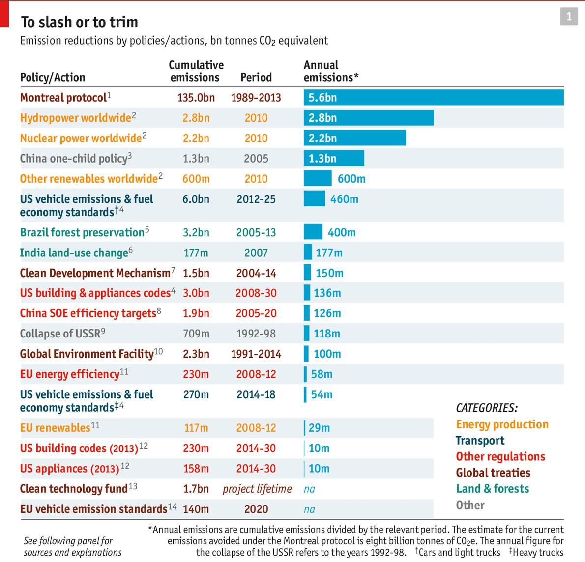
Measuring Segregation

What is segregation?  At its most basic, segregation is the separation of groups of people - by race, class, religion, etc - within a country, community, or establishment. Actually identifying and measuring segregation, however, is not so simple.  In fact, researchers have been debating how to measure segregation for decades, and dozens of segregation indices have been proposed. In the late 1980s, Douglas Massey and Nancy Denton, two lions in the field of race studies, cleared the deck somewhat by performing a systematic analysis of 19 of these segregation indices. They concluded that segregation is not a singular phenomenon, but rather can be understood as consisting of 5 dimensions of spatial variation:

  1. Evenness
  2. Exposure
  3. Clustering
  4. Concentration
  5. Centralization

Nearly two decades later, Sean Reardon and David O'Sullivan proposed an even simpler conceptualization of  residential segregation consisting of only 2 dimensions:

  1. spatial exposure/isolation: the extent that members of one group encounter members of another group (or their own group, in the case of spatial isolation)
  2. spatial evenness/clustering: the extent to which groups are similarly distributed
Reardon and O'Sullivan offered the following graphic to illustrate this two-dimensional idea of segregation.

Reardon and O'Sullivan. 2004. “Measures of Spatial Segregation.” Sociological Methodology 34(1):121-162.

The authors explain the graphic this way:

"In the upper half of the diagram are two patterns where black and white households are evenly distributed throughout space. Both of these patterns have low levels of spatial clustering (or high levels of spatial evenness). In the pattern on the upper right, however, there are more black households in the local environment of each white household (and vice versa) than in the pattern on the upper left; this means that the white-black exposure is higher on the right, and the white isolation is higher on the left. In the bottom half of the figure, both patterns show greater clustering—but roughly the same levels of exposure—than the corresponding patterns above."

Here is another way of looking at it.


Imagine a town (large box on the right) in which 3/4 of the people are blue and 1/4 are red. The town's overall population is represented by the larger people figures on the left. Now, assume that the town is made up of 4 neighborhoods, each of which is represented by the smaller, interior boxes. Imagine that each of these neighborhoods is also made up of 3/4 blue people and 1/4 red people.  The populations of the individual neighborhoods are represented by the smaller people figures. In such a scenario,we can say that the groups are evenly distributed across the town because each neighborhood has the same proportion of blue to red people as the town as a whole. Red people have a high degree of exposure to blue people, but not to other red people. In any given neighborhood, the average red person is exposed to three blue people. By contrast, the blue people have less exposure to red people - only one out of three other people - and more exposure to their own kind.

Here is an alternative scenario with the same overall town population of 3/4 blue people and 1/4 red.

In this case, three out of the four neighborhoods consist entirely of blue people, and all the red people are confined to the fourth neighborhood.  It's the same overall town population as the previous example, but the distribution of the groups amongst the neighborhoods is much different. In this scenario, we can say that there is a very uneven distribution (i.e. clustered). It is uneven because the group proportions in each neighborhood are very different from the proportions of blue and red people for the town as a whole. In addition, there is even less exposure of the two groups to one another, and a lot more exposure to their own kinds (i.e. they are isolated). This latter scenario is what I think most of us imagine when we think of segregation.

Growing Diversity, Persistent Segregation

How segregated is America, and is it becoming more or less so?

In evaluating the degree of segregation, we start by looking at the aggregate demographics of the country as a whole.

PolicyMap http://www.policymap.com/

The US is a mostly White country - approximately 63% non-Hispanic White in 2013, and conversely, 37% non-White (i.e. Hispanic, non-Hispanic Black, Asian and others).


PolicyMap http://www.policymap.com/

If there was a completely even distribution of these groups (i.e. not segregated), we would expect every state in the country to have the same proportions of White and non-White people as the country as a whole. This is clearly not the case.  If we change the scale of our analysis, looking at counties rather than states, we see a more complex pattern, but the basic unevenness of the distribution is still plainly evident.


PolicyMap http://www.policymap.com/

The country's demographic profile is always changing of course.  The US population continues to grow larger, albeit increasingly slowly. Both the White and non-White groups are growing, although that growth is also uneven, both geographically and mathematically. The greatest growth of the White population is occurring largely in the West and Southwest, largely as a result of internal migration.


PolicyMap http://www.policymap.com/

By contrast, growth of the non-White population is greatest in those areas that are currently most White - central and northern parts of the country and Northeast.


PolicyMap http://www.policymap.com/

Equally important, the non-White population is growing much faster than the White population, as a result of both greater natural increase (i.e. births outpacing deaths within the country) and immigration. These two facts - the geographic spread and greater mathematical increase of the non-White population - have led many to conclude that the US is becoming an increasingly diverse nation.


PolicyMap http://www.policymap.com/

This is correct. The US is increasingly diverse because the number of racial-ethnic groups in the population is increasing and the sizes of these groups relative to each other is evening out.  However, increasing diversity of the nation is not the same as decreasing segregation of its neighborhoods.

The US2010 Project, which sponsors research to analyze demographic trends, including segregation, has identified the following trends in its most recent reports on segregation:

  • Almost all communities have grown more diverse, although there is still a wide range of diversity profiles, from predominantly white communities (a shrinking number) to minority-majority and no-majority ones (an increasing number).
  • Black-White and Asian-White residential segregation have been declining consistently since 1990
  • In racially diverse metro areas, Whites increasingly occupy diverse neighborhoods
  • In racially diverse metro areas, about half the Black population and 40 percent of Hispanics still live in neighborhoods without a White presence
  • Since 1990, the highest residential segregation has remained between Blacks and Whites
  • Hispanic-White residential segregation has been on the increase since 1990, especially in the West.

Segregation At a School Near You

When we talk about segregation, we tend to talk about residential segregation. However, segregation is a pernicious problem that manifests in a variety of spaces, like schools. Segregation in schools is surprising for at least two reasons: 1) this is the part of the population where demographic change is really most evident and 2) this is a space that the country has been deliberately trying to desegregate for more than half a century!


The Civil Rights Project at UCLA. 2014. Brown at 60: Great Progress, a Long Retreat and an Uncertain Future.

While a little over 1/3 of the US population is non-White, half of school children are now non-White. The school population is the leading edge of a demographic wave that is sweeping this country.

However, the experience of the average school child belies this monumental fact.


The Civil Rights Project at UCLA. 2014. Brown at 60: Great Progress, a Long Retreat and an Uncertain Future.

The racial exposure of children of different races is still very uneven, despite the increased diversity of the population of school children as a whole.  In the graphic above, note that the average White student (first column) attends a school where 72.5% of the children are White. Black students (second column) attend schools where about 48.8% of children are Black and 27.6% are White. Latino students (fourth column) are in schools that are 57% Latino and 25.1% White.  Asians (third column) are the only racial group (albeit a very large and diverse one) that is exposed more to other groups (especially Whites) than to their own. Asians are a special case who warrant a separate discussion.

In general, we can say that school children in America (except for Asians) have relatively low exposure to other racial groups. Latino school children are the non-White group that is most isolated; least exposed to the dominant group (i.e. Whites) and most exposed to their own racial group. However, it is White school children who are least exposed to other racial groups, and thus most racially isolated. We might even go so far as to say that White school children are actually the most segregated group. But we need to be careful with how we interpret the latter statement.

As the authors of Brown at 60: Great Progress, a Long Retreat and an Uncertain Future point out, "Segregation is typically segregation by both race and poverty. Black and Latino students tend to be in schools with a substantial majority of poor children, but White and Asian students are typically in middle-class schools." This poverty is not just of the individual children, but of the school and the community and their resources and opportunities. The impacts of segregation are not equal, which is one big reason why the Civil Rights Movement has fought so hard against the idea of "separate but equal."

The crusade to desegregate American schools has resulted in major change, especially in the South. In the wake of court-rulings forcing desegregation and other desegregation policies starting in the mid 1960s, schools in the South have become much less segregated.


The Civil Rights Project at UCLA. 2014. Brown at 60: Great Progress, a Long Retreat and an Uncertain Future

However, these accomplishments are fragile. Since the late 1980s, school desegregation policies have been deliberately dismantled as a result of new court rulings, and changes in attitude by the political leadership. As a result, schools have been re-segregating. However, the current state of affairs is still significantly better than it was 50 years ago before these policies were implemented. All of this speaks to the power of policy.

What's equally interesting is how these trends play out on a regional basis. While the South has long suffered under the burden and stigma of its history of racism and segregation, it is now the model of integration, and it is the rest of the country that needs to take a look in the mirror.


The Civil Rights Project at UCLA. 2014. Brown at 60: Great Progress, a Long Retreat and an Uncertain Future

The graphic above shows the level of racial segregation for Black children in schools for different regions of the country between 1968 and 2010. Over the last 40+ years, the South has experienced the largest drop in segregation, followed by the West, and these two regions now have the lowest levels of school segregation for Black children. The Midwest and Border regions (i.e. the historic border between "free" and "slave states") have had modest decreases in segregation. The Northeast, by contrast, has only grown more segregated since the late 1960s and now represents the most racially segregated region of the country for Black school children. This may be a little upsetting to people who still harbor the myth of the liberal and tolerant Northeast (too often set in contrast to the stereotype of an irredeemably racist and intolerant South).

Ferguson, Missouri

How segregated is Ferguson, Missouri, and is it becoming more or less so?

Ferguson is a smallish suburban city (population ~21,000)  in St. Louis County, Missouri. It is part of the Greater St. Louis metropolitan area and a part of the Midwest.  While most of St. Louis County is White, Ferguson and neighboring towns are predominantly Black. According to the ACS 2008-2012, Ferguson is 67% Black and 31% White.

PolicyMap http://www.policymap.com/

Blacks were once a minority in Ferguson. In fact, in 1990, White residents made up 74% of the population, while Blacks were only 25% - the opposite of today's situation. But the city's demographics were shifting; White families were moving out to surrounding suburbs, and Black families were moving in.  By 2000, Ferguson's White population had declined by nearly 50%.  Whites were still a majority in 2000, but the trend was clear. This process by which communities change racially is sometimes described with the benign label of "neighborhood succession," although it may often be described as "White flight."  It is a an all too familiar phenomenon, one process by which the geography of segregation is created and maintained.

The most commonly used measure of segregation is the dissimilarity index. The dissimilarity index reflects the relative distributions of two groups across neighborhoods within a city or metropolitan area; a measure of evenness. It can range in value from 0, indicating complete integration, to 100, indicating complete segregation.  According to the Population Studies Center at the University of Michigan, the greater St. Louis metropolitan area had a 2010 Black-White dissimilarity score of 72.3, meaning that 72.3% of White (or Black) people would need to move to another neighborhood to make Whites and Blacks evenly distributed across all neighborhoods. 

CensusScope http://www.censusscope.org/us/m7040/chart_exposure.html

The level of segregation, as measured by this dissimilarity index, has actually dropped by about 6% since 1990. However, the St. Louis metro region is still the 7th most Black-White segregated major metropolitan region in the US.


CensusScope http://www.censusscope.org/us/m7040/chart_exposure.html

Not surprisingly, the racial exposure of different groups in the St. Louis metro region is also uneven. In the figure above, the rightmost column shows the racial composition (or diversity) of the metro area as a whole. The first five columns represent the average racial composition of the neighborhood of a person of a given race. Note that the racial diversity of the St. Louis metro region is not reflected by the racial exposure of its various groups. If racial exposure matched racial diversity, you would expect all six columns to be identical; that a member of any racial group was exposed to roughly 77% White residents and roughly 22% Black residents in her neighborhood. This is clearly not the case. Amongst non-White groups, Blacks are the most racially isolated. However, Blacks are still less racially isolated than Whites. Whites, once again, are the most racially segregated group; the group with the least exposure to other racial groups.

Are We Ferguson?

How segregated is my community - Salem, Massachusetts - and is it becoming more or less so?

Salem is a midsized suburban city (population ~42,000)  in Essex County, Massachusetts. It is part of the Greater Boston metropolitan area and a part of the Northeast.  Like most of Essex County, and the Commonwealth of Massachusetts, Salem is mostly White, although less so than the county or the state; Salem is 74% non-Hispanic White compared to 80% or more for the county and state. Within Salem, the largest non-White group is Hispanic. Hispanics make up 15% of the city's population, and Blacks about 5%.


CensusScope http://www.censusscope.org/us/m7040/chart_exposure.html

According to the Population Studies Center at the University of Michigan, the greater Boston metropolitan area had a 2010 Black-White dissimilarity score of 64, meaning that 64% of White (or Black) people would need to move to another neighborhood to make Whites and Blacks evenly distributed across all neighborhoods. This level of segregation has declined since 1990. Out of the 102 largest metro regions, the Boston metro region is the 27th most Black-White segregated metropolitan region in the US.

What about Hispanics? The Boston metro region had a 2010 Hispanic-White dissimilarity score of 59.6, meaning that 59.6% of White (or Hispanic) people would need to move to another neighborhood to make Whites and Hispanics evenly distributed across all neighborhoods.While this segregation score is less than that between Whites and Blacks, this Hispanic-White score makes the Boston metro region the 5th most Hispanic-White segregated metropolitan region in the country. Salem is not unlike the rest of the Boston metro region in this respect.

CensusScope http://www.censusscope.org/us/m7040/chart_exposure.html

As with the St. Louis metro region and Ferguson, the racial diversity of Salem is not reflected by the racial exposure of its various groups.  If racial exposure matched racial diversity in Salem, you would expect all six columns to be identical; that a member of any racial group was exposed to roughly 74% White residents and roughly 15% Hispanic residents in her neighborhood. This is clearly not the case. Amongst non-White groups in Salem, Hispanics are the most racially isolated. However, Hispanics are still less racially isolated than Whites. Whites, once again, are the most racially segregated group; the group with the least exposure to other racial groups. 

Again, we must keep in mind that the impacts of segregation, and its meaning, are not equal.

Are We All Ferguson?

The country is certainly diversifying, but segregation is a persistent and real phenomenon. It is not an accidental thing, and its impacts are not the same for each racial or ethnic group. Are we all Ferguson? In too many respects, yes.

The biggest questions that we are left with are familiar ones: why does this continue to happen and how can it be addressed for the long term harmony of society?

Friday, September 26, 2014

Overpopulation and climate change - too many Americans?

In a recent article timed to coincide with the UN Climate Summit in New York City, The Economist offered a ranking of “20 policies and courses of action according to how much they have done to reduce the atmosphere’s stock of greenhouse gases." A number of their choices were unexpected, such as the implementation of China’s one child policy.

China's 1-child policy ranks 4th in the list - allegedly preventing 1.3 billion tons of CO2 from entering the atmosphere. This estimate is taken from a 2007 Reuters article in which "Su Wei of China’s foreign ministry said that his country’s one-child policy, by reducing the number of births between the late 1970s and the mid-2000s by 300m, had reduced carbon emissions by 1.3 billion tonnes in 2005 (because there were fewer people to consume goods which generated greenhouse gases in their production)."

If you do the math, this estimate assumes per capita emissions of 4.33 tons of CO2 for each of those 300 million people whose births were avoided, which is a number consistent with the World Bank's estimate of China's per capita emissions in 2005. Although the The Economist article by no way says this, the implication is that the world is better off with 300 million fewer Chinese.

However, one offensive example deserves another. Had we arrested population growth in the US over the same period, 1970 - 2005, there would have been 95 million fewer Americans in the world. Using the per capita emissions of the US in 2005 - 19.7 tons per person - would have prevented 1.9 billion tons of CO2. This is 1.5 times as much GHGs as that avoided by the Chinese!

One take-home message could be that more would have been accomplished by reducing the number of Americans than Chinese. Maybe America needs a 1-child policy - or the oppressive government that such a policy would require. The last is meant sarcastically.

As far as I can tell, no one is seriously offering population control as an explicit climate change mitigation policy. Nevertheless, I think the issue of population growth and its environmental implications is something worth highlighting. Indeed, fear about overpopulation is a perennial worry. There are legitimate concerns about population growth, but these are mostly to do with its relationship to the rights and status of women and local issues of economic development.  The assumption that population growth is a leading cause of global environmental degradation is really problematic because it misses (or deliberately hides) the radical inequalities in consumption between different populations. Some births have more environmental consequences than others.

It is frequently pointed out that China and India are the most populous countries on the planet (1.4 and 1.3 billion, respectively), but it is not often pointed out that the US is the third most populous country on the planet (319 million). But what's more important, from an environmental perspective, is the relative impact of these populations, not their sizes.

Consider the impact if America reduced its per capita emissions to levels similar to China, or better yet, India.
  • In 2010, American emissions of CO2 were 17.1 tons per capita, while in China they were 6.2 tons per capita, and in India, 1.7 tons per capita.
  • Each American, on average, emitted CO2 equivalent to 2.75 Chinese or 10 Indians.
  • If America reduced its per capita emissions to levels similar to that of China (holding Indian emissions steady), there would be roughly 3.5 billion tons less of CO2 in the world annually. If we treated this 3.5 billion tons of avoided CO2 as "room" for other people to exist, this would be equivalent to making room for another 500 million Chinese, or another 2 billion Indians! 
  • If the US reduced its per capita emissions to that of India (holding Chinese emissions steady), there would be "room" for another 790 million Chinese or 2.9 billion Indians!

This idea of "making room" for other people is not so radical as it might sound. Indeed, "making room" is implicitly what arguments about population growth are often really about, at least when invoked in the context of global environmental problems. But the question is: making room for who and for what?  For wealthy countries to continue a particular way of life with its high environmental impact? For poor countries to develop economically and reduce mass poverty? 

This question touches on a core debate that has plagued climate change negotiations since the 1990s; how to fairly allocate responsibility for climate change mitigation, especially between more developed and less developed countries. A large part of the problem is that consumption (as in per capita emissions of CO2) is still a reliable proxy for wealth. Wealthier countries (and individuals) consume more (emit more CO2 per capita) than less wealthy countries (and individuals). So long as this relationship between wealth/development and consumption hold, we have an environmental and a moral dilemma. This is the core challenge.

Saturday, June 29, 2013

What Makes Data Meaningful?

Telling Tales

Photo of woman listening by The New Institute
Context, of course. Especially narrative context. Putting data into the context of a story makes that data more intuitively understandable, more interesting, more accessible, maybe even more provocative. This was the theme of MAPC's annual Data Day event on June 22: "Data and Story Telling." The keynote presentation was by Boston Globe staff showcasing their 68 Blocks: Life, Death, Hope project. 68 Blocks is a multi-media showcase focusing on the Bowdoin-Geneva section of Dorchester, a Boston neighborhood that's been plagued by a murder rate that is triple that of the city as a whole. As Globe staff explained it, the point of their project was to understand why violence is so persistent in this neighborhood, to tell its stories in a way that hasn't happened before, and maybe, to contribute to awareness and understanding that can be part of the search for solutions.

The work they did was essentially ethnographic. A couple of reporters rented an apartment and lived in the neighborhood for 5 months, inserting themselves into the community and into the lives of a number of families and individuals. They also brought with them the documentary resources of the Globe, like photographers and videographers and sound engineers. And they cleverly tapped into both official sources of data as well as the modern social media cyberscape. The latter is what seems to have caught MAPC's attention for Data Day: using interactive maps to show violence and complaints and the more mundane demographic changes, using Instagram photos by neighborhood residents and allowing them to supplement these images with their own oral stories, etc. The reporters who spoke focused on the stories themselves and the experience of living and working in the neighborhood. At some point however, Ted McEnroe, the moderator (and PR guy for the The Boston Foundation, the event's sponsor), pointed out that the word "data" had hardly been used at all in the panel's discussion. How did the globe use data in the 68 Blocks project? I have to admit that I was bothered by this question. Wasn't it ALL data? Some was quantitative (e.g. statistics) and some was qualitative (e.g. stories, images). But we all knew what McEnroe meant by 'data': the numbers and statistics.

Letting (or Making) the Data Speak

One of the Globe staff responded, "We didn't want the story to sound or look like numbers. ... We used numbers as a way to find the story." They had of course delved into the (quantitative) 'data.' They flooded the City of Boston with Freedom of Information Act requests for public records: school statistics, numbers and types of resident complaints, service calls, sanitation, code enforcement, property records, etc. (This apparently caused some level of panic at City Hall, but that's another story.) They did the same with the Boston Police Department (e.g. 911 calls). Acquiring this data, cleaning it up, and figuring out how to present it was of course a monumental task. And they did manage to acquire a trove of data (which they are interested in sharing with academic institutions. Contact Chris Marstall at the Globe). It's clear enough how the reporters used this data in their stories: citing statistics to support claims, using numbers to hone in on issues or places of interest. But what was new to me was the activity of the Globe's 'Data Journalists' - techies of varying savvy whose job it was to make sense of the quantitative data and to figure out how to present it. They knew that their presentation of the data should work in support of the stories written by the journalists, but that was about the only guidance they had. Like true data jockies - unburdened by either theory or expertise - they took the abstracted data and looked for creative ways to present it. They sifted and sorted and experimented with different visualizations and platforms that would "allow the data to tell its own story." This sounded a little naive to me, or at least misleading.

Data is always the product of some human author - subjective at some level, or at least context-dependent. Data is not the same thing as the phenomenon it describes or enumerates. Data is a construct. Someone made a decision about what phenomena to record (e.g. crimes), what to pay attention to and what to ignore, how to count or code it, where to separate and where to aggregate, where to be precise and where to be general, and on and on, ad nauseum. The result - the data - is not a simple reflection of the phenomenon of interest. I think that a lot of us want to act as if data was authorless - just free floating facts needing to be collected and collated and then communicated. This fiction is convenient because it allows us to act as if we're working with manageable units of unfiltered observation, our perspective unsullied by some other author's dirty fingerprints. But they're there (the fingerprints), whether you see them or not. This is why metadata (i.e. data documentation) and topical expertise are so important when working with data. But the Globe took a deliberately naive approach toward the data. Their goal was to get past the preconceived solutions and cliches and stereotypes that typify discussions of neighborhood violence. Let's look at the neighborhood afresh, they said. And to be fair, their approach is a robust one - presenting the data and stories in as many ways, from as many angles, and from as many perspectives as they could manage. But for all the focus on story-telling, which is essentially linear, their approach was very non-linear, a challenging thing to reconcile.

The audience that attended this event (about 200 or so) was divided about equally among representatives from area non-profits, representatives of municipal governments, small businesses, and college students. One of the MAPC staff confided to me that they were a little nervous about how the Globe's presentation on its 68 Blocks project would be received. At first glance, it might appear to be another sensationalistic, voyeuristic tour of violence and grief in a poor, minority community. But it clearly wasn't perceived that way. One woman stood up to praise the Globe. She represented an anti-violence group and had recently lost her own son to violence. She wanted to thank the Globe staff for their respectful and sympathetic coverage of her tragedy and that of others. But the more common question was simply "How can we do that? How can my organization leverage these tools to tell our stories?" Never mind that year's worth of deep, ethnographic journalism, tell us about the cool web tools. Here is a listing of the tools mentioned:

Data Science Toolkit. Open-source tools to geocode data. TimelineJS. Open-source tool that enables you to build visually-rich interactive timelines. Data for Radicals. Illustrated guide to making a data-driven map with TileMill.
myNeighborhood Census Viewer. U.S. Census 2010 – Data for the City of Boston. Interactive map tool from the Boston Redevelopment Authority. Google Fusion Tables. Tool for sharing, visualizing (maps and graphs), and collaborating with data. Google Refine. Tool for working with messy data, cleaning it up, transforming it from one format into another, extending it with web services, and linking it to databases.

Cleaning Up Dirty Data

Alvin Chang, one of the Globe's lead Data Journalists, said, "People often think that data is just out there. Data is not just out there." Even if the data you want is available (a big 'if'), it is rarely in the form that you need it. It needs to be cleaned up, reshaped, reformatted to fit your purposes. This is one of the aspects of the Big Data revolution that is under appreciated.

In the case of the 68 Blocks project, Globe journalists faced a significant hurdle in compiling data about the Bowdoin-Geneva neighborhood: the neighborhood does not exist as a unit of measurement for any public agency. You cannot simply call up City Hall, or the Police Department, or the school district office, or even the U.S. Census and ask for records for the Bowdoin-Geneva neighborhood. Nobody gathers or holds information for such a place. Bowdoin-Geneva is a segment of the Dorchester neighborhood of Boston (which is itself fuzzily defined). It is spread across several ZIP codes which extend outside the neighborhood, somewhat overlapped by a little more than three Census Tracts, is served by various schools in and out of the neighborhood ... you get the idea. How do you gather information about a place that is not an official unit of measurement? This is an old geographic problem and there is no simple solution. It is a familiar challenge for geospatial analysts. Options are to (re)gather or (re)compile the data according to the area of interest, or to slice and dice the overlapping data units (i.e. lines or polygons) that are available (e.g. ZIP codes, Census Tracts), and make some serious statistical assumptions. Either way, the choices are labor-intensive and highly prone to error. But the results, if successful, are powerful. If you can tie different data sets together based upon location, whether or not they were originally collected with that purpose in mind, you have opened up the possibility to combine data sets from different sources and to examine their relationships.

The ability to clean up dirty data - to reshape and combine disparate sets of data - and to find connections and relationships not otherwise visible in the source data is a powerful ability. It can also be threatening.

Making Connections with the Data

During the afternoon plenary, Latanya Sweeney, from Harvard University's Data Privacy Lab, spoke about the privacy issues surrounding Big Data, and specifically, the increased capacity of commercial organizations to link together databases and thereby discover information about individuals that should be private. The example she used was healthcare data, and she demonstrated her example with theDataMap tool - a network visualization tool that allows you to see how an individual's healthcare data is shared between different organizations, from doctors and hospitals, to government agencies, to pharmaceutical companies and other private entities. One of the more profound implications from her research, which the tool shows, is the proliferation of entities sharing in an individual's information. But even more startling is how easily data privacy standards to protect individuals can be circumvented because of the proliferation of data sharing connections. While data privacy laws, such as HIPPA, require that individual healthcare records be "de-identified" before being shared, so that outside organizations cannot see the names or personally identifying information connected with those records (e.g. diagnoses for diseases, hospital admission history, etc.), it is quite possible for those organizations to deduce or reconstruct that individually identifying information. The method is a classic step in "data cleaning" and preparation - finding "key" variables or characteristics that can clearly link records across different databases. It turns out that birth dates are very powerful in this respect, especially when they can be combined with gender and geographic location. Statistically, it is HIGHLY unlikely that anyone living in your neighborhood has both the same gender and the same birth date as you. You can see how this works in a somewhat creepy application at aboutmyinfo.net, which was developed from Dr. Sweeney's research. If you can clean up dirty data, you might be able to see the dirty laundry. What tales we can tell then!

Creative Presentation of Data

In a completely rational society, evidence of a problem would be enough to motivate action when action was warranted. But since we don't live in that society, we must find other ways to motivate ourselves and our neighbors. Teens at the Urbano Project have taken a creative approach to data in an effort to spark discourse, and possibly, social change. Urbano is a non-profit organization that invites professional artists to work with high school youth "to effect social change through participatory works of contemporary art and performance." This spring they focused on the issue of transportation equity. Several pairs of teens focused on specific statistics of problems or inequity around the Boston region's mass transit system:

Five teens and their artist mentors, Risa Horn and Alison Kotin, talked about the project and development of their art during a final afternoon presentation. The inspiration for the project came while the teens were visiting different Boston neighborhoods as part of their larger theme "Crossing Urban Boundaries." The youth noticed how dramatically different the transit experience was for different communities (and how much they hated getting on certain bus lines). They researched the issue of public transit in Boston, the problems faced by the system, and the inequities of experience. Armed with facts, they faced a challenge: how to express their data artistically and in a way that would inspire discourse and maybe even action.

Like most contemporary art, their work is abstract and symbolic. But it is grounded in the data. Every item and aspect of their art represents a quantum of the data. Each black bracelet is one hour a year lost in extra waiting. Each orange bucket lid is $300 million in debt burden. Every whistle is some number of crimes committed on the T. Their art was developed to be worn, allowing them to take their wobbling, clattering, clinking work onto subways and buses and other public venues. And it was meant to draw attention and questions, which it did. But they went even further, arranging a meeting with MBTA senior staff to deliver their artistic messages. Amazingly, MBTA officials (stone-faced and stuffily dressed, according to the youth) gave them 3 hours of their time for the meeting. By all accounts, this was a painfully awkward encounter. The two groups sat on opposite sides of a large conference table and proceeded to talk at, and past, one another. The funny thing is that, even from the youths' telling, it sounds like the two groups were actually in agreement about the data and the need for solutions. Same data, same basic interpretation, and lots of confusion.

There is a long and venerable tradition of artistic expression in the service of social activism. When done well, art resonates with people - much differently than arid facts or wonkish policy discourse. But was it that resonates? What message is communicated or received? What happens to the data when it becomes embedded in art? Should we even call it data when it is in this form? From my experiences with policy campaigns and social justice organizations, artistic expression and dry data discourse operate side by side ... or maybe it's along a continuum. Inside the legislative chamber, soberly dressed witnesses read aloud carefully researched statistics and analyses, or relate personal stories with a visceral effect - often heartbreaking or infuriating. Outside on the street their allies are dressed in costumes, performing an outrageous skit or stunt, highlighting the ridiculous or unjust state of affairs. In the end, if the campaign is successful, it still won't be clear what moved people to action.

Context

Clearly, "data" are more than disembodied facts. Context matters - both the way in which the data are situated and the way they are communicated. A lot of honest effort goes into trying to "reveal" the meaning of the data, although it sometimes seems that what we are actually trying to do is invest meaning into the data. I don't mean the latter to sound cynical. I believe that data are real, and that we have a responsibility to be faithful to the data. But given the incredible diversity of ways in which data can be honestly handled and understood, it seems naive - and boring - to think that there are simple truths to be extracted or that the data exist outside of our purposes.

Wednesday, June 26, 2013

Reading the Irish Landscape

It's a strange thing to be in a foreign landscape. A lot of odd details stick out - about people's behavior, about the laws and politics, about the architecture, about the plants and animals and even the insects (there are mosquitoes in Ireland). It's hard to know what to focus on, let alone what to make of it.

Like any short-term visitor, I have no doubt that my observations are shallow and distorted, but they are genuinely mine, and the experience was significant to me. The following is a sketch of my impressions and ruminations and my reading of the landscapes I saw.

Irish Itinerary - 10 days, 4 cities, 500 miles. Travel May 22 to June 2.

Cead mile failte romhat! (A hundred thousand welcomes!)

My stand-out impressions

The landscape, and especially the rocks. Lots of open fields of short grass, rolling hills, sheep, and trees few and far between. Rocky in the southwest, especially along the coast. Steep cliffs plunging to the Atlantic. Rocks are the thing here, from volcanic curiosities, to neolithic and medieval ruins, to the web of stone walls in the Gaeltacht and Burren regions. Hillier and less rocky in the north, with more trees (but still not much). One of the students in our group asked our bus driver PJ about animals in Ireland. PJ said, "Mostly little animals - rabbits, squirrels, badgers - all living in harmony and eating each other."

Cliffs of Moher The Burren Giant's Causeway

Ruins and relics. The megalithic ruins in Ireland predate Stonehenge or the building of the pyramids in Egypt. The Hill of Tara and Newgrange sites go back more than 5,000 years. Put your hand (or foot) on Lia Fáil ("the Stone of Destiny") at the Hill of Tara and listen for the roar that declared the High Kings of Ireland until 500 A.D. (didn't work for me). Ireland's Christian roots go back a bit too - to the 5th century. As the Roman Empire collapsed and Europe slid back into the "Dark Ages", monks in Irish monasteries scribbled away to preserve ancient texts, giving us the illuminated Book of Kells, and their ruined, stone monasteries (some ruined by neglect, others by the bloody English).

Celtic High Cross, Inishmore island Stone of Destiny, Hill of Tara Round Tower, Glendalough

Weather. Late May into early June, and I think I took my jacket off once in ten days. According to the locals, if it isn't raining sideways, then it isn't really raining. Enjoy.

Wind at Cliffs of Moher Rain at Dun Aengus Cool in Glendalough

Irish wit. Everybody's a comedian here.

The Linguistic Landscape

Everyone in Ireland speaks English. But not everyone speaks Irish, at least not fluently. The word "Irish" is a shibboleth in Ireland - referring as much to the Gaelic language as to the quality of being from Ireland. I was told that if you ask someone if he speaks Gaelic (rather than Irish), he'll know you're not Irish (as if your accent wouldn't tip him off). The Republic of Ireland is a bilingual country. All public signs are printed in Irish (or Gaelic) first, and then in English. Interestingly, I noticed that no commercial signs were in Gaelic ... I mean Irish. Irish language is a compulsory subject in the state education system in the Republic of Ireland. Almost all Irish speak some Irish, and facility with the language is a point of pride.

Ni tir gan teanga (No nation/land without a language)

Restoring the Irish language, and culture, has been a national project since the late 19th century. One of the first things the Irish Free State did after gaining independence from the UK in the mid 1920s was to establish the Gaeltacht - special districts where the government recognizes that the Irish language is the predominant (or at least a significant) language. Most of the Gaeltacht are found along the western coast of the island, in areas that are largely rural, and unsurprisingly, less economically vibrant. We passed through some of these areas in Galway County on our day trip to Inishmore. The countryside we saw around Spidel was covered in a complex web of dry stone walls, small plots of land, interspersed with stone cottages, some with thatched roofs. Although quaint and even romantic, the ubiquitous stone walls are actually an indicator of the poverty of the land. The stone walls were as much about removing stones to make the land cultivable as marking properties. The Gaeltacht suffer problems similar to a lot of rural areas - lack of economic opportunity and loss of population due to out-migration of their young people looking for work and a better life. This is on top of the persistent pressure of maintaining a minority language in a predominantly English-speaking country. Recent government reports suggest that the Gaeltacht boundaries are too large, no longer encompassing areas that are actually Irish-speaking. But the idea of shrinking those boundaries is emotionally repugnant to the Irish, and it also faces economic resistance. While the traditional rural economy of these areas is rapidly fading, it has been replaced to some extent by a cultural cottage industry devoted to teaching Irish and providing opportunities to engage with traditional Irish culture and crafts.

Nil Gaeilge maith agam (I don't speak good Irish)

The Political Landscape

Ireland is an island divided by visible and invisible borders. Despite its small size, memory and history of the divisions are thick here.

At 32,595 square miles, the island of Ireland is smaller than Maine and slightly larger than South Carolina, but with a population less than that of Massachusetts (a state 1/3 the area). Ireland sits west of the island of Great Britain, separated by the Irish Sea, but not entirely separated. The northern one-sixth of the island, Northern Ireland, is part of the United Kingdom (along with England, Scotland and Wales), while the rest of the island is the independent Republic of Ireland - has been since 1922. Ireland was officially part of the United Kingdom between 1801 and 1922, although it had been invaded and occupied by the British repeatedly since the 12th century. When Irish republicans declared their independence from the UK in the early 20th century, the British loyalists in Northern Ireland (descendants of English and Scottish protestants planted there beginning in the 16th century) opted to stay a part of the UK - much to the annoyance of Irish nationalists, especially that minority living in Northern Ireland. As with any separation, there was bad blood all around. However, violence flared in a big way in the 1960s as Irish nationalists of Northern Ireland battled with their loyalist neighbors and British authorities over issues of discrimination and oppression, cultural and political autonomy, over identity. By the early 1970s, British troops were sent in to re-establish state control. "The Troubles" lasted until the late 1990s, when the Good Friday Agreement (1998) established a system of greater autonomy for Northern Ireland which included power-sharing between Irish nationalist (or Catholic) and British loyalist (or Protestant) communities. In 2005, the Irish Republican Army announced the end of its armed campaign and initiated disarmament. Eight years later, there we were, riding in a tour bus full of students and faculty, into what had been a war zone.

The border between the Republic of Ireland and British Northern Ireland is unmarked. It's less apparent even than the border between the US and Canada. No border patrol or checkpoints. Not even signs letting you know that you've crossed between sovereign territories. Smooth blacktop zips you through bucolic, rural countryside from one isolated community to another. Road signs do change. Ireland is officially bilingual, and all public signs are printed first in Irish (or Gaelic, as the non-Irish say), and then in English. In Northern Ireland, it's all English. Ireland uses the metric system (e.g. kilometers), while Northern Ireland uses English units (e.g. miles) - which can make the speed limit treacherous. Although, from an American perspective, they both drive on the wrong side of the road, so maybe it doesn't matter. Ireland is part of the European Union, and therefore uses the Euro for currency. Northern Ireland currency is based on the British Pound Sterling (£). However, Northern Ireland banks issue their own bank notes, and although they are technically Pound Sterling, are nearly impossible to exchange anywhere outside of Northern Ireland (including the UK!). Luckily, most places in Northern Ireland accept the Euro (and the ATMs dispense Euros by default). Both Ireland and Northern Ireland speak English, but the Northern Ireland accent is distinctly different - and was often quite difficult for me to understand. I kept having to ask people to repeat themselves (which made me feel silly and apologetic).

While there are no apparent physical borders between Ireland and Northern Ireland, the remnants of division are real enough. Memories, especially, seem raw. PJ, our bus driver/tour guide (a man from Cork, the south of Ireland), repeatedly reminded our group to enjoy the visit, but to watch ourselves and avoid political conversations - or any dispute we had no business being involved in. The strange thing is that political disputes are exactly the draw of a place like Northern Ireland. In Derry (or Londonderry to loyalists and the British), the old 17th century walls (20 feet thick in some places) are immovable testimony to centuries of conflict and hostile separation between British settlers and the native Irish. Indeed, these same walls were used in the 1970s and 1980s by British troops to monitor and maintain control over hostile, Irish nationalist neighborhoods. But it's the murals that really catch your eye.

When visiting Derry/Londonderry, you must visit the Bogside neighborhood. It's a majority Catholic (i.e. Irish nationalist) neighborhood just outside the old city walls of Derry. It's covered in gable-wall murals commemorating The Troubles. The themes range from galvanizing pictures of invasion and resistance, to sad memorials of lives cut short, to hopeful signs of peace. It's a major tourist attraction. While the surrounding hills are covered in nearly uniform rows of modern houses, Bogside itself apparently hasn't changed much, either architecturally or attitudinally. It looks like a quiet, working-class neighborhood, but by all accounts, it's still a hotbed. It sits next to the majority-protestant Fountain neighborhood, which has been a constant source of friction. As recently as 2011, Derry was rocked by riots, centered on the Bogside. Indeed, some say that the The Troubles started here, but they reached their culmination in Belfast - our next destination.

Operation Motorman Death of Innocence Petrol Bomber

At the height of The Troubles, Belfast was compared to Beirut on a bad day. Much of the city was destroyed by bombs and fires, and has since been rebuilt. There are significant areas of the surrounding neighborhoods that have yet to recover. The Troubles are still more than just a memory, and as one local told me, "everything is political here." Belfast has murals too - in greater abundance and spread more evenly between Irish nationalist and British loyalist sentiments. Interestingly, our guide seemed much less comfortable in making time for us to get off the bus and look more closely. This was especially the case in the loyalist neighborhoods. I was told by a couple of Irishmen that the people in Northern Ireland, and especially Belfast, have an "edgier" air, which they attribute to the trauma of decades of conflict and violence. But our encounters with people there were entirely positive, and we wandered. Still, security is no joke here. During a drive through a loyalist neighborhood of Belfast, one of the students on our tour asked PJ how big the police force was. PJ replied, "Let me see, about six-foot."

Belfast murals

Unlike Derry, Belfast seems to be asserting greater control of its image and not allowing itself to be defined by The Troubles. The city center boasts elaborate Victorian architecture, much of it repurposed to modern ends - high end restaurants, pubs and shops. The city has made much of the anniversary of the infamous RMS Titanic, which was built here, along with thousands of other ships. The new Titanic Belfast visitor center is located on the site of the former Harland and Wolff shipyard in the city's Tianic Quarter. The ultra-modern, super-interactive center tells the story of Belfast's industrial and maritime heritage, but is heavily focused on the story of the Titanic. I found the back-story to Belfast's rise as an industrial center to be fascinating, but I have to admit that I'm of a generation that was over-saturated with Titanic-mania and I couldn't get out of there fast enough.

Queens College, Belfast Belfast Botanic Gardens Belfast City Hall

From what I could glean from the few Irish I spoke with, Northern Ireland is not yet a popular tourist destination for folks from the Republic of Ireland. According to PJ and others, very few Irish are at all familiar with Northern Ireland. Such reticence does not seem to have affected the international community. Tourism is clearly on the rise. Derry was completely disrupted (happily) by a massive pop music concert that was drawing talent and attendees from around the world. A few days after we left, Belfast was hosting the G8 Summit. No worries about security there. Neenah and I did stumble upon at least one sign of resistance and protest in Belfast, but it was aimed outward rather than inward.

Slán agus beannacht leat (Goodbye and blessings on you)