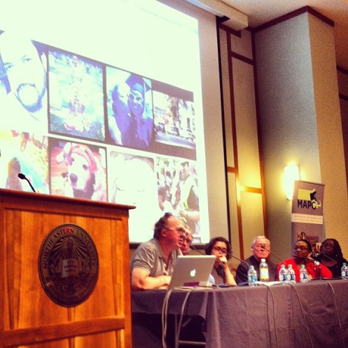
Saturday, June 29, 2013

What Makes Data Meaningful?

Telling Tales

Photo of woman listening by The New Institute
Context, of course. Especially narrative context. Putting data into the context of a story makes that data more intuitively understandable, more interesting, more accessible, maybe even more provocative. This was the theme of MAPC's annual Data Day event on June 22: "Data and Story Telling." The keynote presentation was by Boston Globe staff showcasing their 68 Blocks: Life, Death, Hope project. 68 Blocks is a multi-media showcase focusing on the Bowdoin-Geneva section of Dorchester, a Boston neighborhood that's been plagued by a murder rate that is triple that of the city as a whole. As Globe staff explained it, the point of their project was to understand why violence is so persistent in this neighborhood, to tell its stories in a way that hasn't happened before, and maybe, to contribute to awareness and understanding that can be part of the search for solutions.

The work they did was essentially ethnographic. A couple of reporters rented an apartment and lived in the neighborhood for 5 months, inserting themselves into the community and into the lives of a number of families and individuals. They also brought with them the documentary resources of the Globe, like photographers and videographers and sound engineers. And they cleverly tapped into both official sources of data as well as the modern social media cyberscape. The latter is what seems to have caught MAPC's attention for Data Day: using interactive maps to show violence and complaints and the more mundane demographic changes, using Instagram photos by neighborhood residents and allowing them to supplement these images with their own oral stories, etc. The reporters who spoke focused on the stories themselves and the experience of living and working in the neighborhood. At some point however, Ted McEnroe, the moderator (and PR guy for the The Boston Foundation, the event's sponsor), pointed out that the word "data" had hardly been used at all in the panel's discussion. How did the globe use data in the 68 Blocks project? I have to admit that I was bothered by this question. Wasn't it ALL data? Some was quantitative (e.g. statistics) and some was qualitative (e.g. stories, images). But we all knew what McEnroe meant by 'data': the numbers and statistics.

Letting (or Making) the Data Speak

One of the Globe staff responded, "We didn't want the story to sound or look like numbers. ... We used numbers as a way to find the story." They had of course delved into the (quantitative) 'data.' They flooded the City of Boston with Freedom of Information Act requests for public records: school statistics, numbers and types of resident complaints, service calls, sanitation, code enforcement, property records, etc. (This apparently caused some level of panic at City Hall, but that's another story.) They did the same with the Boston Police Department (e.g. 911 calls). Acquiring this data, cleaning it up, and figuring out how to present it was of course a monumental task. And they did manage to acquire a trove of data (which they are interested in sharing with academic institutions. Contact Chris Marstall at the Globe). It's clear enough how the reporters used this data in their stories: citing statistics to support claims, using numbers to hone in on issues or places of interest. But what was new to me was the activity of the Globe's 'Data Journalists' - techies of varying savvy whose job it was to make sense of the quantitative data and to figure out how to present it. They knew that their presentation of the data should work in support of the stories written by the journalists, but that was about the only guidance they had. Like true data jockies - unburdened by either theory or expertise - they took the abstracted data and looked for creative ways to present it. They sifted and sorted and experimented with different visualizations and platforms that would "allow the data to tell its own story." This sounded a little naive to me, or at least misleading.

Data is always the product of some human author - subjective at some level, or at least context-dependent. Data is not the same thing as the phenomenon it describes or enumerates. Data is a construct. Someone made a decision about what phenomena to record (e.g. crimes), what to pay attention to and what to ignore, how to count or code it, where to separate and where to aggregate, where to be precise and where to be general, and on and on, ad nauseum. The result - the data - is not a simple reflection of the phenomenon of interest. I think that a lot of us want to act as if data was authorless - just free floating facts needing to be collected and collated and then communicated. This fiction is convenient because it allows us to act as if we're working with manageable units of unfiltered observation, our perspective unsullied by some other author's dirty fingerprints. But they're there (the fingerprints), whether you see them or not. This is why metadata (i.e. data documentation) and topical expertise are so important when working with data. But the Globe took a deliberately naive approach toward the data. Their goal was to get past the preconceived solutions and cliches and stereotypes that typify discussions of neighborhood violence. Let's look at the neighborhood afresh, they said. And to be fair, their approach is a robust one - presenting the data and stories in as many ways, from as many angles, and from as many perspectives as they could manage. But for all the focus on story-telling, which is essentially linear, their approach was very non-linear, a challenging thing to reconcile.

The audience that attended this event (about 200 or so) was divided about equally among representatives from area non-profits, representatives of municipal governments, small businesses, and college students. One of the MAPC staff confided to me that they were a little nervous about how the Globe's presentation on its 68 Blocks project would be received. At first glance, it might appear to be another sensationalistic, voyeuristic tour of violence and grief in a poor, minority community. But it clearly wasn't perceived that way. One woman stood up to praise the Globe. She represented an anti-violence group and had recently lost her own son to violence. She wanted to thank the Globe staff for their respectful and sympathetic coverage of her tragedy and that of others. But the more common question was simply "How can we do that? How can my organization leverage these tools to tell our stories?" Never mind that year's worth of deep, ethnographic journalism, tell us about the cool web tools. Here is a listing of the tools mentioned:

Data Science Toolkit. Open-source tools to geocode data. TimelineJS. Open-source tool that enables you to build visually-rich interactive timelines. Data for Radicals. Illustrated guide to making a data-driven map with TileMill.
myNeighborhood Census Viewer. U.S. Census 2010 – Data for the City of Boston. Interactive map tool from the Boston Redevelopment Authority. Google Fusion Tables. Tool for sharing, visualizing (maps and graphs), and collaborating with data. Google Refine. Tool for working with messy data, cleaning it up, transforming it from one format into another, extending it with web services, and linking it to databases.

Cleaning Up Dirty Data

Alvin Chang, one of the Globe's lead Data Journalists, said, "People often think that data is just out there. Data is not just out there." Even if the data you want is available (a big 'if'), it is rarely in the form that you need it. It needs to be cleaned up, reshaped, reformatted to fit your purposes. This is one of the aspects of the Big Data revolution that is under appreciated.

In the case of the 68 Blocks project, Globe journalists faced a significant hurdle in compiling data about the Bowdoin-Geneva neighborhood: the neighborhood does not exist as a unit of measurement for any public agency. You cannot simply call up City Hall, or the Police Department, or the school district office, or even the U.S. Census and ask for records for the Bowdoin-Geneva neighborhood. Nobody gathers or holds information for such a place. Bowdoin-Geneva is a segment of the Dorchester neighborhood of Boston (which is itself fuzzily defined). It is spread across several ZIP codes which extend outside the neighborhood, somewhat overlapped by a little more than three Census Tracts, is served by various schools in and out of the neighborhood ... you get the idea. How do you gather information about a place that is not an official unit of measurement? This is an old geographic problem and there is no simple solution. It is a familiar challenge for geospatial analysts. Options are to (re)gather or (re)compile the data according to the area of interest, or to slice and dice the overlapping data units (i.e. lines or polygons) that are available (e.g. ZIP codes, Census Tracts), and make some serious statistical assumptions. Either way, the choices are labor-intensive and highly prone to error. But the results, if successful, are powerful. If you can tie different data sets together based upon location, whether or not they were originally collected with that purpose in mind, you have opened up the possibility to combine data sets from different sources and to examine their relationships.

The ability to clean up dirty data - to reshape and combine disparate sets of data - and to find connections and relationships not otherwise visible in the source data is a powerful ability. It can also be threatening.

Making Connections with the Data

During the afternoon plenary, Latanya Sweeney, from Harvard University's Data Privacy Lab, spoke about the privacy issues surrounding Big Data, and specifically, the increased capacity of commercial organizations to link together databases and thereby discover information about individuals that should be private. The example she used was healthcare data, and she demonstrated her example with theDataMap tool - a network visualization tool that allows you to see how an individual's healthcare data is shared between different organizations, from doctors and hospitals, to government agencies, to pharmaceutical companies and other private entities. One of the more profound implications from her research, which the tool shows, is the proliferation of entities sharing in an individual's information. But even more startling is how easily data privacy standards to protect individuals can be circumvented because of the proliferation of data sharing connections. While data privacy laws, such as HIPPA, require that individual healthcare records be "de-identified" before being shared, so that outside organizations cannot see the names or personally identifying information connected with those records (e.g. diagnoses for diseases, hospital admission history, etc.), it is quite possible for those organizations to deduce or reconstruct that individually identifying information. The method is a classic step in "data cleaning" and preparation - finding "key" variables or characteristics that can clearly link records across different databases. It turns out that birth dates are very powerful in this respect, especially when they can be combined with gender and geographic location. Statistically, it is HIGHLY unlikely that anyone living in your neighborhood has both the same gender and the same birth date as you. You can see how this works in a somewhat creepy application at aboutmyinfo.net, which was developed from Dr. Sweeney's research. If you can clean up dirty data, you might be able to see the dirty laundry. What tales we can tell then!

Creative Presentation of Data

In a completely rational society, evidence of a problem would be enough to motivate action when action was warranted. But since we don't live in that society, we must find other ways to motivate ourselves and our neighbors. Teens at the Urbano Project have taken a creative approach to data in an effort to spark discourse, and possibly, social change. Urbano is a non-profit organization that invites professional artists to work with high school youth "to effect social change through participatory works of contemporary art and performance." This spring they focused on the issue of transportation equity. Several pairs of teens focused on specific statistics of problems or inequity around the Boston region's mass transit system:

Five teens and their artist mentors, Risa Horn and Alison Kotin, talked about the project and development of their art during a final afternoon presentation. The inspiration for the project came while the teens were visiting different Boston neighborhoods as part of their larger theme "Crossing Urban Boundaries." The youth noticed how dramatically different the transit experience was for different communities (and how much they hated getting on certain bus lines). They researched the issue of public transit in Boston, the problems faced by the system, and the inequities of experience. Armed with facts, they faced a challenge: how to express their data artistically and in a way that would inspire discourse and maybe even action.

Like most contemporary art, their work is abstract and symbolic. But it is grounded in the data. Every item and aspect of their art represents a quantum of the data. Each black bracelet is one hour a year lost in extra waiting. Each orange bucket lid is $300 million in debt burden. Every whistle is some number of crimes committed on the T. Their art was developed to be worn, allowing them to take their wobbling, clattering, clinking work onto subways and buses and other public venues. And it was meant to draw attention and questions, which it did. But they went even further, arranging a meeting with MBTA senior staff to deliver their artistic messages. Amazingly, MBTA officials (stone-faced and stuffily dressed, according to the youth) gave them 3 hours of their time for the meeting. By all accounts, this was a painfully awkward encounter. The two groups sat on opposite sides of a large conference table and proceeded to talk at, and past, one another. The funny thing is that, even from the youths' telling, it sounds like the two groups were actually in agreement about the data and the need for solutions. Same data, same basic interpretation, and lots of confusion.

There is a long and venerable tradition of artistic expression in the service of social activism. When done well, art resonates with people - much differently than arid facts or wonkish policy discourse. But was it that resonates? What message is communicated or received? What happens to the data when it becomes embedded in art? Should we even call it data when it is in this form? From my experiences with policy campaigns and social justice organizations, artistic expression and dry data discourse operate side by side ... or maybe it's along a continuum. Inside the legislative chamber, soberly dressed witnesses read aloud carefully researched statistics and analyses, or relate personal stories with a visceral effect - often heartbreaking or infuriating. Outside on the street their allies are dressed in costumes, performing an outrageous skit or stunt, highlighting the ridiculous or unjust state of affairs. In the end, if the campaign is successful, it still won't be clear what moved people to action.

Context

Clearly, "data" are more than disembodied facts. Context matters - both the way in which the data are situated and the way they are communicated. A lot of honest effort goes into trying to "reveal" the meaning of the data, although it sometimes seems that what we are actually trying to do is invest meaning into the data. I don't mean the latter to sound cynical. I believe that data are real, and that we have a responsibility to be faithful to the data. But given the incredible diversity of ways in which data can be honestly handled and understood, it seems naive - and boring - to think that there are simple truths to be extracted or that the data exist outside of our purposes.

Wednesday, June 26, 2013

Reading the Irish Landscape

It's a strange thing to be in a foreign landscape. A lot of odd details stick out - about people's behavior, about the laws and politics, about the architecture, about the plants and animals and even the insects (there are mosquitoes in Ireland). It's hard to know what to focus on, let alone what to make of it.

Like any short-term visitor, I have no doubt that my observations are shallow and distorted, but they are genuinely mine, and the experience was significant to me. The following is a sketch of my impressions and ruminations and my reading of the landscapes I saw.

Irish Itinerary - 10 days, 4 cities, 500 miles. Travel May 22 to June 2.

Cead mile failte romhat! (A hundred thousand welcomes!)

My stand-out impressions

The landscape, and especially the rocks. Lots of open fields of short grass, rolling hills, sheep, and trees few and far between. Rocky in the southwest, especially along the coast. Steep cliffs plunging to the Atlantic. Rocks are the thing here, from volcanic curiosities, to neolithic and medieval ruins, to the web of stone walls in the Gaeltacht and Burren regions. Hillier and less rocky in the north, with more trees (but still not much). One of the students in our group asked our bus driver PJ about animals in Ireland. PJ said, "Mostly little animals - rabbits, squirrels, badgers - all living in harmony and eating each other."

Cliffs of Moher The Burren Giant's Causeway

Ruins and relics. The megalithic ruins in Ireland predate Stonehenge or the building of the pyramids in Egypt. The Hill of Tara and Newgrange sites go back more than 5,000 years. Put your hand (or foot) on Lia Fáil ("the Stone of Destiny") at the Hill of Tara and listen for the roar that declared the High Kings of Ireland until 500 A.D. (didn't work for me). Ireland's Christian roots go back a bit too - to the 5th century. As the Roman Empire collapsed and Europe slid back into the "Dark Ages", monks in Irish monasteries scribbled away to preserve ancient texts, giving us the illuminated Book of Kells, and their ruined, stone monasteries (some ruined by neglect, others by the bloody English).

Celtic High Cross, Inishmore island Stone of Destiny, Hill of Tara Round Tower, Glendalough

Weather. Late May into early June, and I think I took my jacket off once in ten days. According to the locals, if it isn't raining sideways, then it isn't really raining. Enjoy.

Wind at Cliffs of Moher Rain at Dun Aengus Cool in Glendalough

Irish wit. Everybody's a comedian here.

The Linguistic Landscape

Everyone in Ireland speaks English. But not everyone speaks Irish, at least not fluently. The word "Irish" is a shibboleth in Ireland - referring as much to the Gaelic language as to the quality of being from Ireland. I was told that if you ask someone if he speaks Gaelic (rather than Irish), he'll know you're not Irish (as if your accent wouldn't tip him off). The Republic of Ireland is a bilingual country. All public signs are printed in Irish (or Gaelic) first, and then in English. Interestingly, I noticed that no commercial signs were in Gaelic ... I mean Irish. Irish language is a compulsory subject in the state education system in the Republic of Ireland. Almost all Irish speak some Irish, and facility with the language is a point of pride.

Ni tir gan teanga (No nation/land without a language)

Restoring the Irish language, and culture, has been a national project since the late 19th century. One of the first things the Irish Free State did after gaining independence from the UK in the mid 1920s was to establish the Gaeltacht - special districts where the government recognizes that the Irish language is the predominant (or at least a significant) language. Most of the Gaeltacht are found along the western coast of the island, in areas that are largely rural, and unsurprisingly, less economically vibrant. We passed through some of these areas in Galway County on our day trip to Inishmore. The countryside we saw around Spidel was covered in a complex web of dry stone walls, small plots of land, interspersed with stone cottages, some with thatched roofs. Although quaint and even romantic, the ubiquitous stone walls are actually an indicator of the poverty of the land. The stone walls were as much about removing stones to make the land cultivable as marking properties. The Gaeltacht suffer problems similar to a lot of rural areas - lack of economic opportunity and loss of population due to out-migration of their young people looking for work and a better life. This is on top of the persistent pressure of maintaining a minority language in a predominantly English-speaking country. Recent government reports suggest that the Gaeltacht boundaries are too large, no longer encompassing areas that are actually Irish-speaking. But the idea of shrinking those boundaries is emotionally repugnant to the Irish, and it also faces economic resistance. While the traditional rural economy of these areas is rapidly fading, it has been replaced to some extent by a cultural cottage industry devoted to teaching Irish and providing opportunities to engage with traditional Irish culture and crafts.

Nil Gaeilge maith agam (I don't speak good Irish)

The Political Landscape

Ireland is an island divided by visible and invisible borders. Despite its small size, memory and history of the divisions are thick here.

At 32,595 square miles, the island of Ireland is smaller than Maine and slightly larger than South Carolina, but with a population less than that of Massachusetts (a state 1/3 the area). Ireland sits west of the island of Great Britain, separated by the Irish Sea, but not entirely separated. The northern one-sixth of the island, Northern Ireland, is part of the United Kingdom (along with England, Scotland and Wales), while the rest of the island is the independent Republic of Ireland - has been since 1922. Ireland was officially part of the United Kingdom between 1801 and 1922, although it had been invaded and occupied by the British repeatedly since the 12th century. When Irish republicans declared their independence from the UK in the early 20th century, the British loyalists in Northern Ireland (descendants of English and Scottish protestants planted there beginning in the 16th century) opted to stay a part of the UK - much to the annoyance of Irish nationalists, especially that minority living in Northern Ireland. As with any separation, there was bad blood all around. However, violence flared in a big way in the 1960s as Irish nationalists of Northern Ireland battled with their loyalist neighbors and British authorities over issues of discrimination and oppression, cultural and political autonomy, over identity. By the early 1970s, British troops were sent in to re-establish state control. "The Troubles" lasted until the late 1990s, when the Good Friday Agreement (1998) established a system of greater autonomy for Northern Ireland which included power-sharing between Irish nationalist (or Catholic) and British loyalist (or Protestant) communities. In 2005, the Irish Republican Army announced the end of its armed campaign and initiated disarmament. Eight years later, there we were, riding in a tour bus full of students and faculty, into what had been a war zone.

The border between the Republic of Ireland and British Northern Ireland is unmarked. It's less apparent even than the border between the US and Canada. No border patrol or checkpoints. Not even signs letting you know that you've crossed between sovereign territories. Smooth blacktop zips you through bucolic, rural countryside from one isolated community to another. Road signs do change. Ireland is officially bilingual, and all public signs are printed first in Irish (or Gaelic, as the non-Irish say), and then in English. In Northern Ireland, it's all English. Ireland uses the metric system (e.g. kilometers), while Northern Ireland uses English units (e.g. miles) - which can make the speed limit treacherous. Although, from an American perspective, they both drive on the wrong side of the road, so maybe it doesn't matter. Ireland is part of the European Union, and therefore uses the Euro for currency. Northern Ireland currency is based on the British Pound Sterling (£). However, Northern Ireland banks issue their own bank notes, and although they are technically Pound Sterling, are nearly impossible to exchange anywhere outside of Northern Ireland (including the UK!). Luckily, most places in Northern Ireland accept the Euro (and the ATMs dispense Euros by default). Both Ireland and Northern Ireland speak English, but the Northern Ireland accent is distinctly different - and was often quite difficult for me to understand. I kept having to ask people to repeat themselves (which made me feel silly and apologetic).

While there are no apparent physical borders between Ireland and Northern Ireland, the remnants of division are real enough. Memories, especially, seem raw. PJ, our bus driver/tour guide (a man from Cork, the south of Ireland), repeatedly reminded our group to enjoy the visit, but to watch ourselves and avoid political conversations - or any dispute we had no business being involved in. The strange thing is that political disputes are exactly the draw of a place like Northern Ireland. In Derry (or Londonderry to loyalists and the British), the old 17th century walls (20 feet thick in some places) are immovable testimony to centuries of conflict and hostile separation between British settlers and the native Irish. Indeed, these same walls were used in the 1970s and 1980s by British troops to monitor and maintain control over hostile, Irish nationalist neighborhoods. But it's the murals that really catch your eye.

When visiting Derry/Londonderry, you must visit the Bogside neighborhood. It's a majority Catholic (i.e. Irish nationalist) neighborhood just outside the old city walls of Derry. It's covered in gable-wall murals commemorating The Troubles. The themes range from galvanizing pictures of invasion and resistance, to sad memorials of lives cut short, to hopeful signs of peace. It's a major tourist attraction. While the surrounding hills are covered in nearly uniform rows of modern houses, Bogside itself apparently hasn't changed much, either architecturally or attitudinally. It looks like a quiet, working-class neighborhood, but by all accounts, it's still a hotbed. It sits next to the majority-protestant Fountain neighborhood, which has been a constant source of friction. As recently as 2011, Derry was rocked by riots, centered on the Bogside. Indeed, some say that the The Troubles started here, but they reached their culmination in Belfast - our next destination.

Operation Motorman Death of Innocence Petrol Bomber

At the height of The Troubles, Belfast was compared to Beirut on a bad day. Much of the city was destroyed by bombs and fires, and has since been rebuilt. There are significant areas of the surrounding neighborhoods that have yet to recover. The Troubles are still more than just a memory, and as one local told me, "everything is political here." Belfast has murals too - in greater abundance and spread more evenly between Irish nationalist and British loyalist sentiments. Interestingly, our guide seemed much less comfortable in making time for us to get off the bus and look more closely. This was especially the case in the loyalist neighborhoods. I was told by a couple of Irishmen that the people in Northern Ireland, and especially Belfast, have an "edgier" air, which they attribute to the trauma of decades of conflict and violence. But our encounters with people there were entirely positive, and we wandered. Still, security is no joke here. During a drive through a loyalist neighborhood of Belfast, one of the students on our tour asked PJ how big the police force was. PJ replied, "Let me see, about six-foot."

Belfast murals

Unlike Derry, Belfast seems to be asserting greater control of its image and not allowing itself to be defined by The Troubles. The city center boasts elaborate Victorian architecture, much of it repurposed to modern ends - high end restaurants, pubs and shops. The city has made much of the anniversary of the infamous RMS Titanic, which was built here, along with thousands of other ships. The new Titanic Belfast visitor center is located on the site of the former Harland and Wolff shipyard in the city's Tianic Quarter. The ultra-modern, super-interactive center tells the story of Belfast's industrial and maritime heritage, but is heavily focused on the story of the Titanic. I found the back-story to Belfast's rise as an industrial center to be fascinating, but I have to admit that I'm of a generation that was over-saturated with Titanic-mania and I couldn't get out of there fast enough.

Queens College, Belfast Belfast Botanic Gardens Belfast City Hall

From what I could glean from the few Irish I spoke with, Northern Ireland is not yet a popular tourist destination for folks from the Republic of Ireland. According to PJ and others, very few Irish are at all familiar with Northern Ireland. Such reticence does not seem to have affected the international community. Tourism is clearly on the rise. Derry was completely disrupted (happily) by a massive pop music concert that was drawing talent and attendees from around the world. A few days after we left, Belfast was hosting the G8 Summit. No worries about security there. Neenah and I did stumble upon at least one sign of resistance and protest in Belfast, but it was aimed outward rather than inward.

Slán agus beannacht leat (Goodbye and blessings on you)

Wednesday, May 22, 2013

The Past, Present, and Future of Environmental Justice

A celebration

This year marks a milestone for Environmental Justice in the U.S. It's been 20 years since the establishment of the U.S. Environmental Protection Agency's (EPA) Office of Environmental Justice (OEJ). The OEJ has been celebrating this anniversary with a series of 20th Anniversary Videos featuring stories and interviews with Environmental Justice leaders from communities, non-governmental organizations, and public institutions. Locally, we've also been celebrating the 20th anniversary of a Boston-based Environmental Justice organization - Alternatives for Community and Environment (ACE). Since 1993, ACE has been both a local and a national leader for Environmental Justice, defending and promoting disadvantaged communities through a mix of legal and technical support, policy advocacy, and community organizing. Last week, ACE held a celebratory event entitled "An Evening for ACE" at the SEIU Local 615 headquarters in downtown Boston. The event brought together a panel of ACE's leaders: the original founders of ACE, Charlie Lord and Bill Shutkin, as well as the current Executive Director Kalila Barnett, former ED Penn Loh, and REEP alumnus and ACE board member Carlos Moreno. The event was moderated by Julian Agyeman. The event was well attended by longtime friends and supporters, as well as new friends and allies. A 20th anniversary is a good time to reminisce, take stock, and look to the future.

What EJ has wrought

The fundamental insight that the Environmental Justice movement has brought to environmental debates is simply this: not everyone is affected by environmental issues in the same way. This is the case for at least two reasons. Environmental burdens (and amenities) are almost never equally distributed. Since the late 1980s, a voluminous body of research has repeatedly shown that waste sites, noxious industry, and various other forms of environmentally degrading activity are often located in lower income communities and communities of color. The converse is often true too, such that the distribution of "good" things, like parks and trees, are often not in these same communities. Second, even when it appears that some environmental issues are equally distributed (at least geographically), there can still be inequity. We're all exposed to climate change, but we're not all equally vulnerable, and we're not all equally responsible.

A second big idea that EJ has drawn attention to (a public health perspective) is that "the environment" is "where we live, work and play." The environment is not just wilderness or the oceans or scenic landscapes. It is the day-to-day places occupied and used and built by people, and for most of humanity, this means urban environments. The result of this insight is "the environment" includes the environmental quality of homes, schools, workplaces, neighborhoods - and the infrastructure that makes human-environments function and liveable. And as the EJ movement has shown repeatedly, the environmental quality of "where we live, work and play" can vary enormously from community to community, whether we're talking about air pollution, solid waste management, access to quality schools or access to transportation. When we bring these two EJ insights together, what we have is a fundamentally social perspective on the environment - one that sees environmental quality as a reflection and a consequence of the relationships between people. Degraded environments and marginalized communities go hand in hand. Improving the environment does not just mean fixing environmental problems; it means changing the relationships between people. Improved public participation, more transparency by government and the private sector, fair and realistic opportunities for well being and economic security, and honest dialogues about social challenges, goals and needs - and of course, quality science.

Where we're going and what we need

At the ACE event, Professor Agyeman asked the panelists to talk about where they saw the EJ movement heading. What kinds of topics are drawing the EJ movement's interest now and into the foreseeable future? The panelists identified a number of topics and campaigns of growing interest: food justice, transportation justice, just sustainability, green justice, and economic justice. What's striking to me is how much more attention the EJ movement has placed on solutions-based or productive initiatives - programs to develop and promote positive or constructive change in marginalized communities and for the society at large. This is a significant change from the early EJ movement which was so focused (necessarily) on identifying problems and reacting to threats. But ACE's current ED, Kalila Barnett, struck a note of caution. She acknowledged the importance of the topics identified by the others, but she reminded us that the battles of the past are still with us. ACE and other EJ activists are still dealing with problems of localized air pollution, siting of noxious industry, waste siting, and discriminatory treatment. And while the Environmental Justice movement celebrates the anniversary of the founding of important institutions and organizations, its campaigns are still woefully under-funded. Environmental Justice has changed this country's environmental conversation, but it remains marginalized in support and funding in comparison to "mainstream" and environmental causes and organizations.

There is a lot to celebrate in the Environmental Justice movement, and there is a lot yet to be done. Leaders in the movement, like those highlighted by the EPA and by ACE, deserve our thanks and praise. For the movement to make positive change, we still need more people and organizations to step up. Thanks to those who have supported this cause and to those yet to do so. This is how we improve our environment and strengthen a movement and our society.

Friday, May 17, 2013

The 'G' in STEM

Geography is a STEM subject.

STEM is an acronym for Science, Technology, Engineering and Mathematics, and STEM is the focus of an enormous amount of educational effort, across the U.S. and abroad. The basic idea is that STEM education is vital to the success of individual students and the technological and economic progress of our society. STEM encompasses a broad array of subjects, although this point bears repeating. The STEM Education Coalition calls for "An inclusive definition and use of the term “STEM education” by federal and state programs that is not limited to only math and science, but also embraces engineering and technology, and broadly encompasses related STEM fields and their unique needs."

I had an opportunity recently to highlight Geography's STEM credentials at the "Get Energized! Powering the Future with Green STEM Education" event hosted by the Boston Youth Environmental Network (BYEN) at the Benjamin Franklin Institute of Technology in Boston. The purpose of this event was to draw attention to teaching about sustainability, renewable energy, and clean technology concepts and careers. I was invited to set up an interactive demonstration for the exhibition session, and also to participate as a panelist in a session on Pathways into Green STEM Careers.

It isn't hard to demonstrate how Geography is both a STEM subject and a promising ('Green') career pathway, especially when it involves geospatial technology (e.g. digital maps, GPS, satellite imagery). I demonstrated the use of ArcGIS, a Geographic Information Systems (GIS) program, for the siting of wind turbines in Massachusetts. I adapted this from an exercise I've used for both my undergraduate and graduate GIS students. You can see screenshots of the process in the slideshow, although we did it interactively at the event. MassGIS has an online Wind Energy Site Screening Tool that lets you interactively explore a similar process. My goal was to highlight how a spatial approach and perspective - combining geospatial technology and an understanding of human-environment interactions (core aspects of Geography) - supports sustainable, green development. It can be lucrative too. A recent article in Science Careers entitled "The New Cartographers" highlighted the nation's need for a ready supply of graduates in GIS and related fields. This echoes analyses by the U.S. Department of Labor.

Geospatial analysis is a sub-discipline of Geography, and Geography, and the STEM aspects of Geography, are more than geospatial technology. Geography has many definitions, but a common aspect is its spatial perspective - across social and physical phenomena - and interest in "big picture" relationships, especially human-environment relationships. Geography has long been recognized as a core discipline, but that recognition hasn't always been robust. Of nine areas listed as core academic subjects in the No Child Left Behind Act, geography is the only one that has no dedicated federal funding program. In Massachusetts, Geography education has gotten short shrift. However, the Massachusetts Geographic Alliance has been spearheading an effort to establish a state-sanctioned Commission on Geography Education to study the status of geography education in Massachusetts and make recommendations to the legislature. Ideally, this effort will result in reinstatement of Geography education in K-12 education throughout the Commonwealth. National Geographic has been leading a parallel effort at the national level in its campaign for "geo-literacy."

Given the national interest in STEM education, and Geography's solid STEM identity, it seems strange to have to plead Geography's case. But the work must be done.

Sunday, April 14, 2013

Learning "To Do" Geography

I recently returned from the annual Association of American Geographers conference, which took place this year in Los Angeles, California. This is a big event (over 8,000 people from around the planet), with hundreds of sessions, panels, workshops, and field trips to choose from. In addition to presenting my own, latest research, catching up with old friends, networking, and trying to make it to all of the "sponsored socials" that involved a free drink, the big challenge was choosing which sessions to attend. This year I focused on sessions that dealt with pedagogy and career preparation (for my students).

Here are some highlights that I picked up:

Field experience is crucial in the teaching of Geography - even for introductory or service courses.

Students (and teachers) need to constantly practice the art of seeing the real world landscape through a geographical perspective. Professor Herschel Stern of Miracosta College argued that "seeing landscape" means going out and learning how to describe and categorize features (understanding the concept of categories), identifying based on shared characteristics, and practicing how to describe location, orientation, neighborhood boundaries, etc. - basic skills for any Geographer. Professor William Selby of Santa Monica College argued that both cultural and physical Geographers need to practice taking field notes and recording their observations; basic skills for all researchers and another aspect of "seeing landscape."

Organized field experiences do not necessarily mean supervised, group trips in which the entire class has to be transported to some location at the same time (with all of the attendant expenses and logistical and liability headaches). Consider non-guided, independent fieldwork lessons. Professor Mark Hafen from the University of South Florida described how he manages to send students from his Wetland Environment class on a minimum of 4 field trips each semester. The key is that they go out independently or in small groups - on their own time. Before sending them out, he does in-class demonstrations of how to use equipment and record observations. In order to work well, field trips have to be very focused with specific objectives. For Hafen, data collection is qualitative to demonstrate understanding of concepts. Students graph the data they collect and then read their data to look for patterns and understand what they saw in the field and how the graph helps. Herschel and Selby asked us to consider sending students to museums, visitor centers, and self-guided nature walks, which many students have probably never seen.

"Spatial Thinking" is important across the college curriculum, but it still needs clarification.

With the publication of the National Research Council report Learning to Think Spatially, and the funding of a Spatial Intelligence Learning Center, there is growing interest in how to teach spatial thinking. There is now convincing evidence that spatial abilities are related to both success and participation in STEM (Science, Technology, Engineering and Math) disciplines. More generally, there is an increasing recognition of the importance of spatial thinking as a unifier of academic disciplines, including physical science, social sciences, arts and humanities. However, it is also widely acknowledged that spatial thinking is not fostered in our educational system. Professor Mary Hegarty of the University of California Santa Barbara gave a summary report from a specialist meeting convened in Santa Barbara in December 2012 which brought together geographers, cognitive scientists, and experts in a range of other disciplines (including architecture, astronomy, chemistry, geosciences, neuroscience, history and political science) to examine how to best educate spatial thinking at the college level. Hegarty asserted (quite provocatively) that "current attempts to teach spatial thinking are faith based." There is little objective evidence that attempts to teach spatial thinking are effective. She argued that we need to understand and articulate what we mean by "spatial thinking." What are the core concepts and skills? What are the varieties of spatial thinking? She explained that the only really well developed assessments of spatial skills come from cognitive psychology, and these have focused only on "mental rotation". We still need to know more ways to define and assess spatial thinking.

Not everyone is at a loss for a definition of spatial thinking. Diana Stinton from the University of Redlands offered her definition of spatial thinking as "the ability to visualize and interpret location, position, distance, direction, pattern, relationships, movement, and change through space (and time)." She made a point, however, of distinguishing between common understandings of "spatial skills" and "geography-based skills." Spatial skills, she explained, are those more typically associated with engineering skills (e.g. "mental rotation") and 3D visualization. By contrast, geography-based skills are those associated with maps and geospatial technology, and aimed at Geography students and educators. Regardless of origin, she argued that we should promote spatial literacy across all disciplines. Spatial literacy is the "confident and competent use of maps, mapping, and spatial thinking to address ideas, situations and problems in the real world." Stinton is a leader in this realm. I had the pleasure of seeing her speak before at the GIS conference at Bucknell. She recently launched a web resource for GIS educators - teachgis.org

Geoscience jobs are/will be booming, but Geography remains poorly understood by employers AND students

Heather Houlton from the American Geosciences Institute (AGI) and colleagues from the AAG discussed current trends in the geosciences job market and the challenges of aligning learning outcomes to workforce competencies. Houlton reported on a number of promising job trends for Geographers:

  • There are over 260,000 geoscience jobs in the U.S. today
  • Based on demographics, we can expect 130,000 of current geoscientists to retire in the next few years, opening up those positions to new people
  • By 2021, up to 72,000 completely new geoscience jobs are expected to be created
  • By 2021, the U.S. will see between 15,000 and 45,000 new graduates from the geosciences, leaving a big gap between job supply and demand (better for those demanding)
The less encouraging news is that Geography is "under-recognized" or poorly understood by employers, while Geography graduates continue to have a narrow conception of their career prospects. These observations are based on recent surveys by the AGI. As most job-seekers learn, there are VERY few jobs with the title "Geographer", but there A LOT of jobs that need geographic skills and perspectives. While Geography advocates need to work on educating employers and labor agencies, it is up to educational institutions and faculty to do a better job of educating students about the vast variety of career possibilities that a Geography education provides.

Saturday, March 23, 2013

Why Online Courses are not just for students

The MOOC spectre

There has been a lot of hand wringing and excitement about the push toward online learning, and especially MOOCs - Massive Open Online Courses. With apologies to Dr. Martin Luther King, Jr., I want to say that I've been to the MOOC, and I don't mind.

MOOCs offer free college courses online. There are a number of organizations offering these MOOCs, all with variations on a basic approach (e.g. Coursera, edX, Udacity). In general, the courses are conducted entirely via the Internet, the instruction happens asynchronously (i.e. not in "real time"), and literally tens of thousands of "students" can be enrolled in any one course. Oh, and they're free.

There are lots of reasons to be excited and scared (depending on your position) about the possibilities and implications of MOOCs. Imagine the possibility of packaging the best instruction by the best professors from the world's best colleges and universities and giving it away for free to anyone with time and an internet connection. A lot of people see MOOCs, and online learning in general, as the coming "disruptive technology" for higher education. Like mp3s and Napster to the music industry, or Orbitz and Travelocity to the travel industry.

While MOOCs are indeed new, online teaching is not. The reality for most colleges and universities is that online instruction is already here. It's not just available through Phoenix or Coursera; it has penetrated the bricks and mortar of nearly every institution in the country. My institution has been offering online and hybrid courses for a number of years now. This coming fall, over 200 of our courses will be offered either fully online or as hybrid courses (mostly online but meeting in person periodically). I'll be teaching my first online courses this fall as well. Online instruction at my institution is entirely voluntary for faculty (at the moment), but there is real professional and social pressure to engage with online tools and to figure out how to adapt them (or adapt to them) for teaching.

MOOCs as Faculty Opportunity

There are lots of questions about how online instruction compares to face-to-face instruction, and what it means for students, but for the moment, I want to draw your attention to the opportunities that MOOCs offer to other instructors. In a nutshell, MOOCs give college instructors an opportunity to see how other college instructors teach online (and maybe to learn something too). This is invaluable. It's an open (and dirty) secret that college faculty are not really taught how to teach. We've been trained to do research (especially those with PhDs), and then we're hired as faculty and someone says, "By the way, you've got to teach these classes too." The pressures on faculty to do online learning have only compounded the depth of this pedagogical ignorance. What an opportunity to be able to see how another professor does the deed.

While on sabbatical, I took the opportunity to try out some MOOCs, initially out of sheer curiosity, but also in a sort of blind assumption that these online courses would offer me an easy and convenient way to brush up on my technical skills for both research and teaching. Between October 2012 and March 2013, I took three courses through Coursera:

  • Computing for Data Analysis, taught by Dr. Roger Peng from the Johns Hopkins Bloomberg School of Public Health. This course was focused on learning how to use R for data analysis. R is a statistical and graphical programming language and software package, and it is probably the hottest thing for researchers around the world who do statistical analysis (and it's free!).
  • An Introduction to Interactive Programming in Python, co-taught by Drs. Joe Warren, Scott Rixner, John Greiner, and Stephen Wong from Rice University. This course was focused on learning how to use Python to build simple, interactive applications. Python is a "high level" programming language (some would say a 'scripting' language) that is used by a wide variety of organizations - from Google and Yahoo to NASA - for an incredible variety of computer applications, especially online. Python is also the primary programming language for interacting with ArcGIS, an industry-standard Geographic Information System (GIS) that I teach and use for research.
  • Data Analysis, taught by Dr. Jeff Leek from the Johns Hopkins Bloomberg School of Public Health. This course was focused on learning how to apply statistics for data analysis using R. When I enrolled, I did not realize that Professors Peng and Leek were from the same institution, but as it turned out, they structured their courses to be complementary. In fact, it was recommended that students enrolling in Dr. Leek's course either have experience with R or else take Dr. Peng's class first.

Summarizing the Coursera experience

The courses all followed a common organizational scheme, which apparently reflects Coursera's pedagogical philosophy. Each course lasted from 4 to 8 weeks.

Lecture

Each week, the instructors posted roughly two hours worth of video lectures, broken up in to 15 to 20 minute segments. These videos were viewable through the course website, on YouTube, or could be downloaded to a personal computer and played offline. Videos were closed captioned, and transcripts of these videos, along with PowerPoint slides and other learning aids, were made available for download.

Testing

Each week, there was a quiz. Quizzes were multiple choice and graded automatically with immediate feedback on the score achieved, as well as what questions I got right and wrong. In most cases, I could retake the quiz up to three times in order improve my score. Maybe "quiz" is the wrong word. Although they were generally 5 to 10 questions at most, and multiple choice, these were not the kinds of quizzes you could just bang through. Each quiz, regardless of the class, took me a minimum of two hours to complete. Seriously.

Assignments and evaluation

There were open-ended exercises or projects too. These ranged from writing small programs that performed some specific task, to doing statistical analyses and writing up reports. These non-quiz assignments required evaluation by a living person. This is where the technology and technique of MOOCs really becomes apparent. Each of these courses had 30,000 to 100,000 people enrolled. I kid you not. Open-ended evaluation of assignments is done through peer evaluation. After submitting a given assignment (before the deadline had passed), my next task was to evaluate from 4 to 5 assignments submitted by my classmates using a rubric form. I was given the chance to look each one over first, and then I went through one by one to rate how well they met each of the rubric items, and in some cases, to provide written feedback on why I thought they had done something imperfectly or really well. After reviewing the assignments submitted by my peers, I then evaluated my own submission. In order to receive a grade for an assignment, I had to evaluate my peers - before the evaluation deadline (usually a week after the submission deadline). Apparently, research on peer assessment and crowd sourcing have shown that these methods can provide accurate feedback and assessment, as well as being a meaningful learning experience. I don't know if the instructors (or their TAs) checked to see if the peer assessments were accurate, but I'm hoping so.

Classroom interaction

Personal interaction and discussion throughout the class were conducted through forums or message boards where participants posted questions and observations and responded to those posts. The forums are a core part of these online courses and crucial to a successful class experience. Forums are the places where you meet your classmates, (potentially) have an opportunity to have a personal interaction with the instructor, and where you raise your hand (metaphorically speaking) to ask a question or offer an opinion or answer a question. Because it is unlikely, if not impossible, for the instructor to answer individual questions, it really falls to the participants in these fora to support each other. I can say with complete honesty that I would not have passed a couple of these courses without the help of my fellow classmates through these fora.

Results may vary

While all the courses followed a common format, the quality of the experiences was not the same. This shouldn't be surprising; online courses can vary in quality just as much as face-to-face courses. I recently read an ironic (if not sadly funny) story about an online course to teach participants how to run online courses that went seriously awry. As the author of that story pointed out, it was only one instance and did not prove anything. However, it does seem to undermine the idea that online courses will simply steamroll over traditional education by way of simple standardization or a universal solution to teaching. Online courses can suck just as much as in-class courses. So there. Of course, I have never heard of an in-class course at my university being canceled in midstream in order to make adjustments. Usually someone has to be physically incapacitated or die (usually the instructor). But I digress.

Lessons learned

Here are some of the lessons I learned from my experience with Coursera and about online teaching:

  • Online courses are no easier than in-class courses. Sure, you can 'attend' class while in your pajamas at home, but that's about the only easier part.
  • Online classes require real time self-discipline from students (and instructors). Because online courses are asynchronous, you don't need to sit in a classroom at a specified time during the week, but you do need to figure out how to set aside adequate time for reviewing videos, reading literature, taking quizzes or tests, completing homework, accomplishing final projects, etc. Without time discipline, you will suffer and perform poorly and you might not learn much. Everyone must understand this before beginning an online course. I spent on average 15 - 20 hours a week on each course - maybe I'm just slow.
  • "Mastery learning" works. Give students immediate and meaningful feedback immediately AND give them the opportunity to re-attempt homework or quizzes. This is most easily accomplished with the automatically graded quizzes, but it still requires forethought on the part of the instructors to provide useful feedback for incorrect answers as well as devising multiple opportunities to try again. Kudos to the crew from Rice University and Dr. Peng on this one.
  • Peer assessment can be a real time saver for grading and it can be a meaningful experience IF the evaluation rubric is set up well. The idea of a grading rubric is simple enough, but it has to be written clearly enough so that anyone (not just the person who wrote it) can understand how to apply it. It helps to provide examples of what constitutes a "superb" versus a "good" analysis (although even those descriptors are so vague as to be useless). A better approach is to clearly identify what qualifies as a minimum level of quality for a given rating (e.g. "The methodology contains these three elements ..."). Also, peers must be able to submit written comments in addition to standardized ratings in order to explain their ratings. It's extremely frustrating to be downgraded for something and not know why or how to improve it. Again, kudos to Rice University and Dr. Peng.
  • Narrated PowerPoint presentation lectures are still just PowerPoint presentations - only less exciting. Most of the video lectures in all three courses were essentially narrated PowerPoint presentations. However, the crew at Rice University did things which relieved some of the lecture tedium and, in some cases, actually made lectures fun. They varied the video lectures between still shots of PowerPoint slides, action shots of their computer screen as they worked through problems, action video of them talking and interacting with each other, and even regular gag skits. The variety in content and approach, and the regular movement on the screen really made a difference in helping to hold my attention. I especially liked the way they were able to integrate these little inset videos showing them talking while the larger image displayed either a slide or the speaker's screen. Good use of the technology and excellent co-teaching. Online instructors, are you listening?
  • Interaction between students is crucial. I found out the hard way that you MUST read through the fora regularly to see what other people are talking about. Lectures and reading material cannot (and should not) make all of the intellectual connections or provide all of the answers. Participating in interactive fora is like participating in critical group activity - you end up feeling smarter and accomplishing more than you would on your lonesome. I was also really impressed by the degree of support that students were willing to give one another (without giving away the answers!). And it is amazing how helpful it can be when students simply share an "aha!" moment. However, the value of these fora, and how to properly engage in them, may not be apparent to everyone. Students must be told how to effectively get help and help themselves in this brave, new online world. Dr. Peng did an excellent job of explaining how to get help and ask questions in an online environment and it's definitely worth watching this lecture.

Although it ate up six months of my life, I am really glad that I took the time to experience how MOOCs work. I have brushed up on some technical skills. These experiences have also helped me, as a college professor, to think about my approach to online teaching and to teaching in general. Whatever else they may prove to be, MOOCs are an opportunity for faculty to learn from other faculty.

Tuesday, February 5, 2013

Making Decisions in a Climate of Doubt

A billboard by the Heartland Institute outside of Chicago, May 2012.

What's going on with climate change? How are we doing?

As of this writing, the concentration of CO2 (carbon dioxide) in the atmosphere, as recorded atop Mauna Loa mountain in Hawaii, is a little over 394 ppm (parts per million) and rising at an accelerating rate.    Carbon dioxide, as we all should now know, is the primary greenhouse gas that is driving anthropogenic (i.e. human-caused) global climate change.  The higher the concentration, the greater the change.

For some time, climate scientists have warned that atmospheric concentrations of CO2 above 350 ppm would take the planet into a realm that is outside of historic human experience.  Indeed, "350" has become the mantra of a global grassroots movement seeking political and social solutions to this imminent threat.  Atmospheric concentrations of CO2 have exceeded 350 ppm since the late 1980s.  Given the current trajectory, some scientists and policy makers have proposed a new target.  In order to keep the change in global average temperature over the next century to less than 2 degrees Celsius (a small number with massive implications), we need to keep the concentration below 450 ppm.  At a recent open lecture at Northeastern University, Henry Jacoby, Professor of Applied Economics at the Center for Energy and Environmental Policy Research at MIT, warned, "We are about to blow through that level."  Massive change is going to happen.  He suggested, somewhat resignedly, that we will likely need to move the goal post back to something like 650 ppm - a concentration that projects a global average temperature rise somewhere in the neighborhood of 3 - 4 degrees Celsius by the end of the century.  This is a global temperature difference not seen since dinosaurs walked the earth.  No polar ice caps.  Sea levels from 30 to 120 meters higher than they are today.

There are lots of bright spots. Since about 2008, emissions of greenhouse gases from the wealthier, industrialized nations of the world have actually flattened, or even decreased.  This is good, although it appears to have had more to do with the economic recession and the rapid replacement of coal with suddenly cheaper natural gas (from fracking) than with with any deliberate effort.  Unfortunately, these decreases have been more than offset by rapid growth in emissions from industrializing nations, especially China and Brazil.

There is significant global action on climate change, but it is widely distributed or dispersed.  This action has been happening almost entirely at the local or regional level: by the European Union, by many states or provinces, by cities, and by a variety of non-governmental organizations, from businesses to non-profits.  Coordinated global action by the world's governments, however, is notably absent.  This absence of global leadership is striking.  The science around climate change has only improved.  The signals of rapid global change are not only clearer, but appear to be moving faster than even the worst case scenarios had predicted.  And for the last twenty years, it's been popularly assumed that a single, global treaty is the only viable way for the world to avert disruptive climate change. What happened to global leadership?  There is no simple answer to this question, but one issue that must be confronted is the role of the social and political movement against action on climate change.

The Kyoto Protocol was the first, and up to this point, last, serious international attempt at a global treaty to reduce greenhouse gases. The Kyoto Protocol was drafted in December 1997 by hundreds of delegates from around the world under the auspices of the United Nations Framework Convention on Climate Change.  It called for binding limits on greenhouse gas emissions, starting with the developed nations most responsible for the bulk of emissions to date.  At that time, the climate change policy debate was informed by more than three decades of accumulating scientific analysis from around the globe.  That's right, three decades.  Negotiations over this global treaty were intense and plagued by uncertainty, but advocates at the time had more than just decades of science on their side.  There was precedent for coordinated, global action on environmental threats.  Only a decade before, the U.S. led the charge on the Montreal Protocol.  This successful, global treaty banned the production of CFCs, a ubiquitous class of chemicals eating away at the ozone layer - a thin layer of gas in the atmosphere that protects life on Earth from the sun's harmful ultraviolet radiation. A variety of other international environmental efforts, from the control of transboundary air pollution to whaling, seemed to show that there could be coordinated, global action.

Proponents of the Kyoto Protocol argued that the science around climate change was well supported, the problem was urgent, action today would reduce the necessity of more costly and disruptive responses in the future, etc.  To a contemporary reader, what is probably most striking is how much these arguments haven't changed, and how they have only been reinforced by accumulating evidence and improved scientific understanding.  However, advocates of the Kyoto Protocol faced a new breed of political opposition.  New conservative organizations, many of which only emerged in the late 1980s, launched a well-funded and strategic campaign to cast doubt on scientific predictions about climate change and to thwart any policies aimed at controlling greenhouse gas emissions. In the early 1990s, these efforts were strengthened by a dramatic political shift in the U.S. that enabled conservative Republicans to take control of Congress, giving skeptical, conservative voices a powerful platform to amplify their message and to steer the U.S. away from making binding commitments. It was a critical moment in the incipient effort to tackle climate change, and we are still grappling with the implications of those decisions.

Today, it's hard to imagine a time when the issue of climate change wasn't polarized or partisan.  But there was a time, mostly before the late 1980s.  The political division over climate change that emerged in the late 1980s and 1990s was profound, and it caught a lot of people off guard.  Some of the arguments against the Kyoto Protocol are still familiar and not particularly radical: concerns about impacts to the U.S. economy, concerns about imposing limits on the U.S. while allowing countries like China and India to continue unrestricted, concerns about the technical ability of the U.S. to even achieve the desired reductions.  There were, of course, more exotic arguments: the argument that more carbon dioxide will be good for plants and make the world greener, the argument that a warmer world will actually be more comfortable, etc.  But the most disruptive arguments have been the distortions and aspersions leveled at the science and scientists themselves.  Attacking the science seems to have sown confusion and left very little space for common ground.

During that last climate change lecture, Professor Jacoby asserted that the "Argument [against action on climate change] is not really about the science; it's about the role of government in your life."  Possibly.  It has often seemed that the debates have been at cross purposes; one side talking past the other.  For the scientifically-literate and the environmentally sensitive, the debate over whether to take action, or whether there even is a problem, has simply been baffling and frustrating.

It seems to me that the drama of climate change is not the increasingly dire message of impending catastrophe.  Rather, the drama is the political debate.  Climate change may be the biggest environmental threat ever faced by humanity, but it is the politics that poses the greatest challenge.

The story of the Kyoto Protocol is an excerpt from the chapter "Should the U.S. have signed the Kyoto Protocol?" in my book The Environment since 1945 (New York: Facts On File, 2012).